> tool
LIVE90 minutes to redesign India's largest bank
Self-initiated redesign of SBI's net banking — login, dashboard, full payment flow — designed directly in code with Next.js + Claude Code. One person, 90 minutes, deployed live prototype against a $1.3B-per-year IT institution.

Why this exists
State Bank of India is the country's default bank — 480M+ accounts, the institution a vast share of India is required to deal with, not one they chose. Its net banking is also, by long reputation, one of the most frustrating consumer interfaces in the country: a login spread across three pages, a dashboard that buries the two things people actually came to do — check a balance, pay someone — under two decades of accreted menus, and a payment flow that throws you out to a separate OTP page and expects you to find your way back.
SBI's annual IT spend runs to the order of $1.3B. So this was never a pitch to SBI, and not really about SBI. It was a test of a claim I keep making — that one designer working directly in code can move faster on the thing that matters than a budget and a committee can. I gave myself 90 minutes and the three screens that carry the whole product, and built a working prototype to see how far that goes.
What it does
A deployed prototype of the core journey — sign in, see your money, pay someone — rebuilt so each surface does one job, and nothing hands you off mid-task.
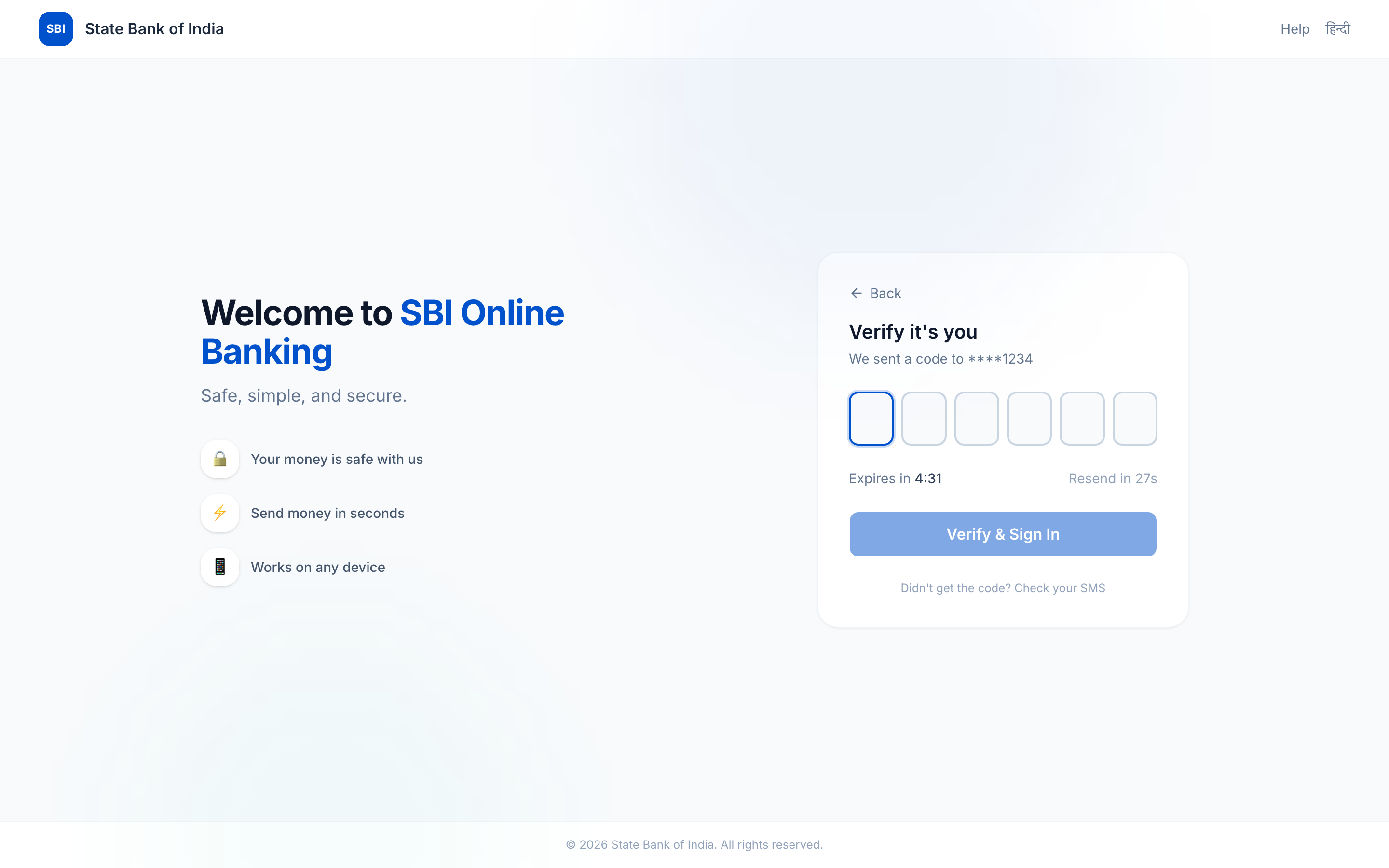
Login: three pages down to one. SBI's sign-in walks you through separate username, password, and OTP pages. I collapsed it to a single screen, with the OTP entered inline the moment it's needed instead of a redirect that loses your place — the same inline-OTP principle I later reused in the IU Invoice tool.
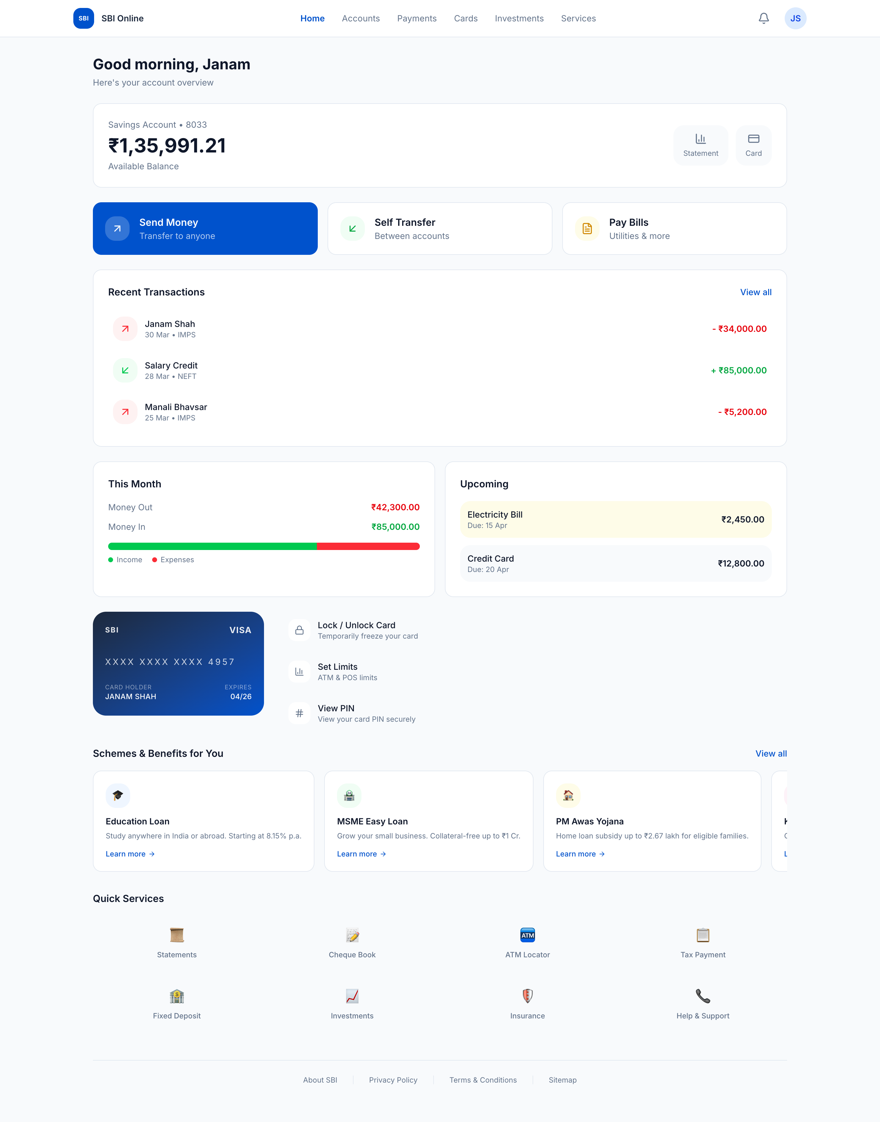
Dashboard: the answer first. Instead of a wall of menu tiles, it opens on the balance and the two actions almost everyone is there for — pay and transfer — with everything else demoted to where it belongs.
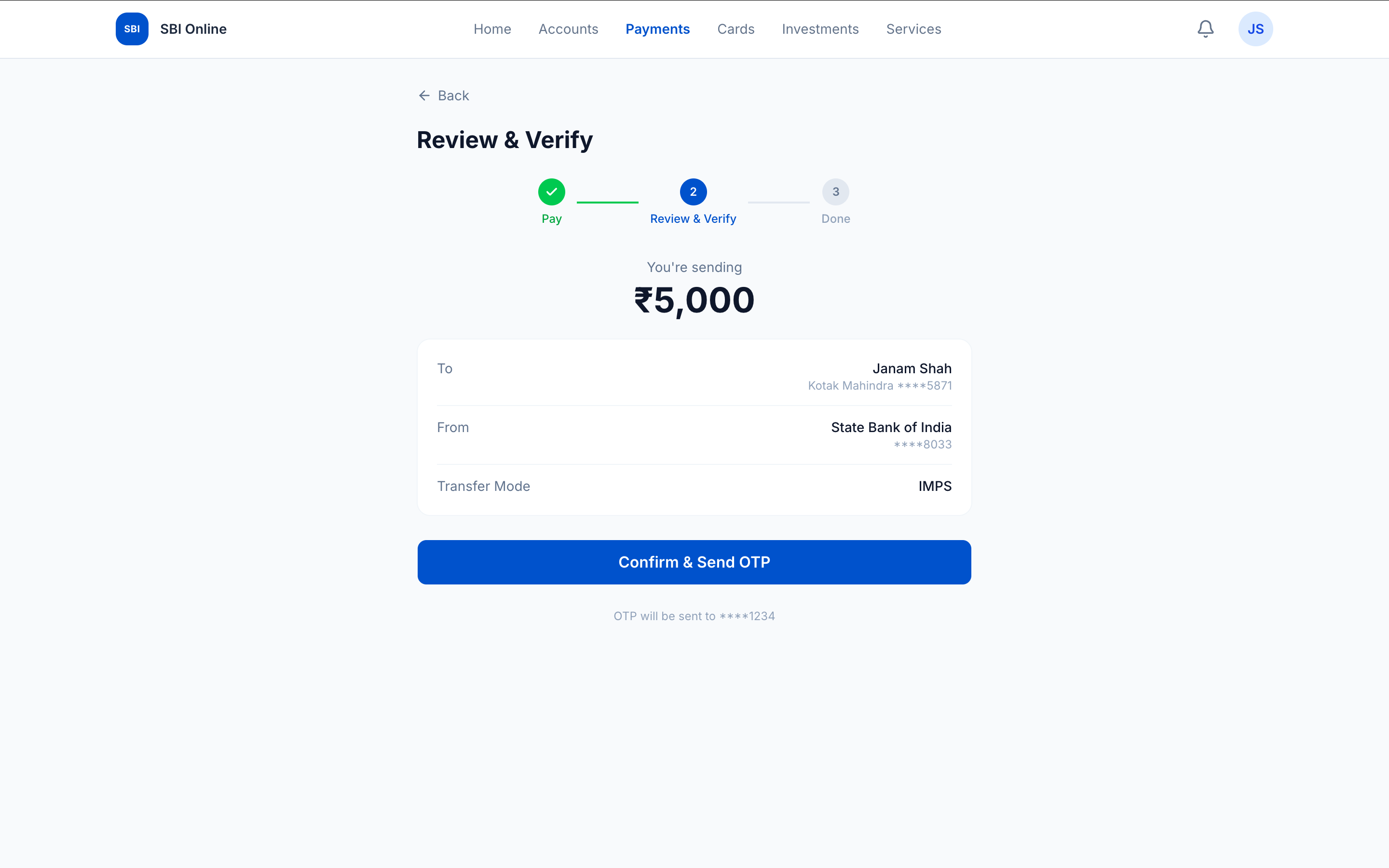
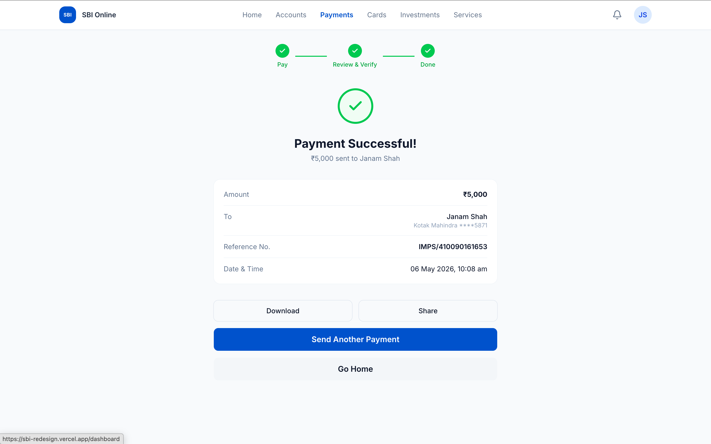
Payment: five steps down to three. The original flow scatters payee selection, amount, review, OTP, and confirmation across five hand-offs. I rebuilt it as three meaningful steps — choose payee → enter amount → review-and-confirm — with the OTP folded into the confirm step rather than a page of its own. The user never leaves the flow; the confirmation is a real screen, not a dead-end.
How it's built
Designed directly in code — Next.js + Tailwind, no Figma, no static comps. I worked in VS Code against live components and iterated in the browser, which is the entire method: at this speed the design tool and the build tool have to be the same thing, because a static mock-up of a banking flow tells you nothing about whether the inline OTP actually feels faster than the page it replaced. You only learn that by clicking it.
Login, dashboard, and the five-steps-to-three payment flow, deployed as a live prototype, in ninety minutes. One person built a clearer version of the core flow than a $1.3B-a-year IT institution ships — which is the only point worth making. The problem was never budget or technology. It was that nobody sat down and designed the thing the customer actually does.