Build · State Bank of India · 2026
90 minutes to redesign
India's largest bank.
Self-initiated redesign of SBI's net banking — login, dashboard, complete payment flow — designed directly in code with Next.js + Claude Code. One person, one laptop, 90 minutes from empty repository to a deployed live prototype.
Role
Designer · Frontend Developer
Timeline
90 minutes
Team
1 person, 1 laptop
Scope
Product Design, Frontend Development
Background
$750B bank. 520M customers.
A login flow built in 2008.
State Bank of India is a $750-billion government-owned bank with 520 million customers and $1.3 billion in annual IT spending. Its net banking interface still requires a CAPTCHA, three page loads across three subdomains, and three different visual identities — just to log in. My father, who uses Google Pay daily, refuses to use SBI online because he can't get past the login.
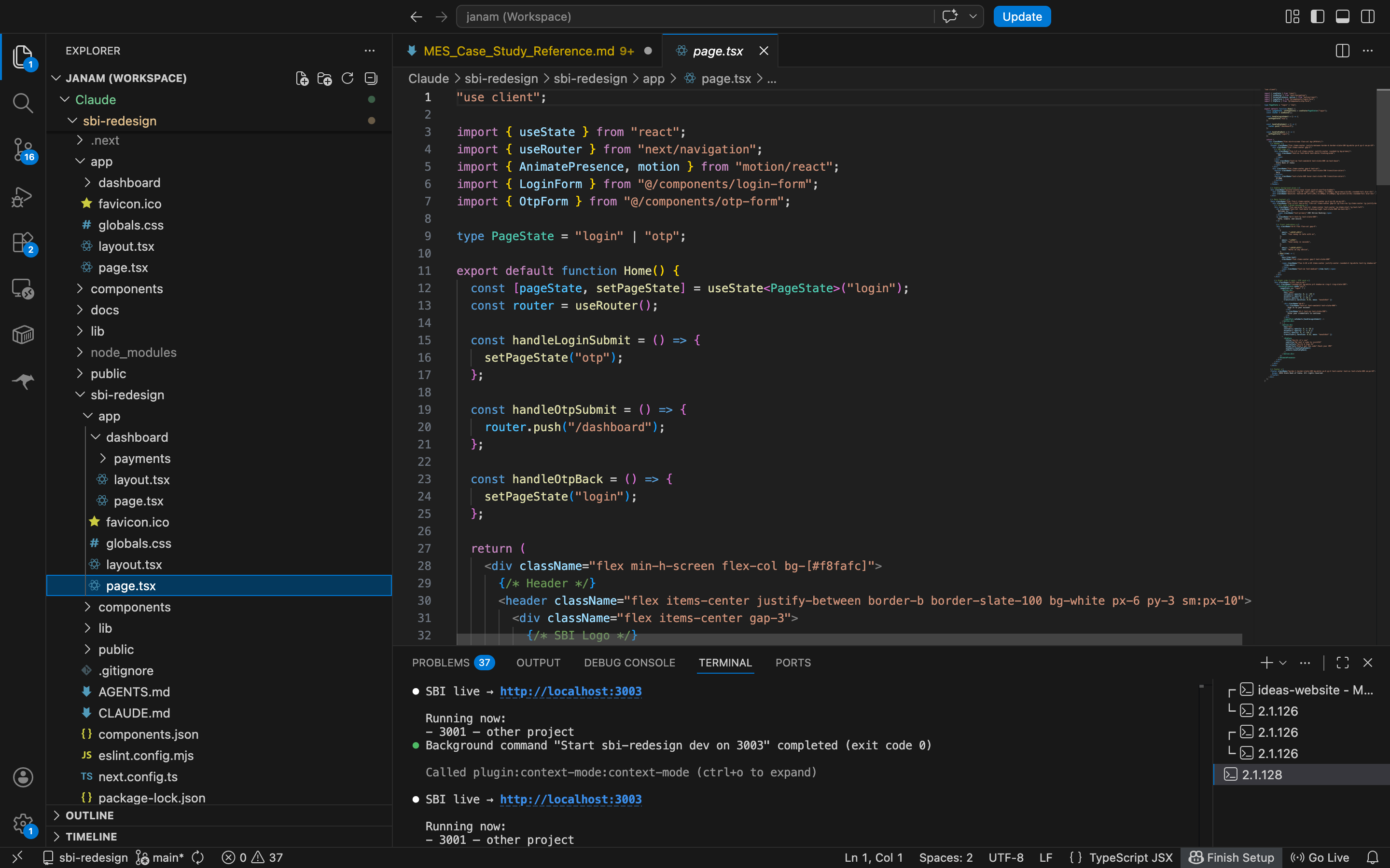
I redesigned the login, dashboard, and complete payment flow in 90 minutes — designing directly in code using Next.js, Tailwind, and Claude Code as an AI execution multiplier. No Figma. No wireframes. No handoff. The prototype is live on Vercel.
Impact
What one designer-developer shipped in 90 minutes, against a $1.3-billion-per-year IT budget that has been delivering the opposite for years.
The problem
Not outdated. Actively hostile.
The SBI net-banking interface is not a 2008 design that didn't age well. It is a 2026 system that prioritises the institution's desire to cross-sell over the customer's need to complete a single task. Three failures stack on every login.
Failure 01 · Login
Original SBI login — 3 pages, 3 subdomains, 3 visual identities. Copy-paste disabled. CAPTCHA. 'Site best viewed in Microsoft Edge 79+.'
Three page loads across three subdomains. Three different visual identities. Copy-paste disabled on the password field. CAPTCHA that fails on correct input frequently enough that users have learned to expect it.
Failure 02 · Dashboard
Original YONO dashboard — carousel of cartoon icons, 24+ sidebar links, promotional banners, no hierarchy.
Every product SBI sells — deposits, loans, investments, cards, insurance — on one page with no hierarchy. A scrolling carousel of cartoon icons sits above an account overview that shows numbers but not balances. 24+ links in the sidebar. Promotional banners compete with functional elements.
Failure 03 · Payment
Original payment flow — 5-step stepper, review opens a modal, authentication opens a side panel, receipt has carousel ads.
Five-step stepper. Review opens a modal. Authentication opens a side panel. Transaction details is a long-scroll form. The receipt page has carousel ads. The user is pushed in and out of context four times to send one payment.
What the data confirms
Public sentiment matches the screens.
1.2 / 5
SBI Secure OTP app
1.72 / 5
SBI net banking on MouthShut
1.6 / 5
IsItDownRightNow user rating
164 “enhancements” shipped to YONO in FY2025. None of them addressed the fundamental UX problems visible above.
The system
Six tools, one person,
designer and developer fused.
The 90 minutes were possible because the tool stack was already internalised — ten years of design practice and an AI-assisted execution layer that turns a design intent into a shipping component in the same minute it's articulated.
Janam
designer + dev
Next.js 16
TypeScript
Tailwind 4
shadcn/ui
Framer Motion
Claude Code
The 90-minute pipeline
Decade of practice + lived frustration
→ Claude → live prototype.
10 yrs design
UX practice
Lived experience
SBI customer 15+ yrs
Prompts
design intent
Claude Code
execution multiplier
Setup
0–10 min
Login flow
10–30 min
Dashboard
30–60 min
Payment flow
60–90 min
GitHub
git push origin
Vercel
live in 60s
The 4 phases
Setup. Login. Dashboard. Payment.
0 → 10 min
Setup
Next.js 16 scaffold, TypeScript, Tailwind 4, shadcn/ui, Framer Motion. Routing for login, dashboard, payment flow. Project boots in under a minute thanks to a 10-year muscle memory of how Next.js apps are structured.
10 → 30 min
Login flow
Split-screen layout, credentials form, OTP state with animated transition via Framer Motion. Reusable OTP input component composed once and reused in the payment flow. CAPTCHA explicitly removed — security theatre, not security.
30 → 60 min
Dashboard
Header, balance card, three action cards (Send Money / Self Transfer / Pay Bills), recent transactions, monthly summary chart, upcoming bills, debit-card management, schemes, quick services. All dummy data modeled on the real SBI account structure I use every month.
60 → 90 min
Payment flow
Payee selection with search and recent payees, amount entry with history-derived chips, inline review summary, inline OTP, success receipt with reference number. Stepper component reused across the three payment steps. Final commit, git push, Vercel auto-deploys at minute 90.
The work
Eight surfaces. One coherent flow.
Login, OTP, dashboard, and the full payment flow — from payee selection to a downloadable receipt. Every screen is shipping code, deployed at sbi-redesign.vercel.app.

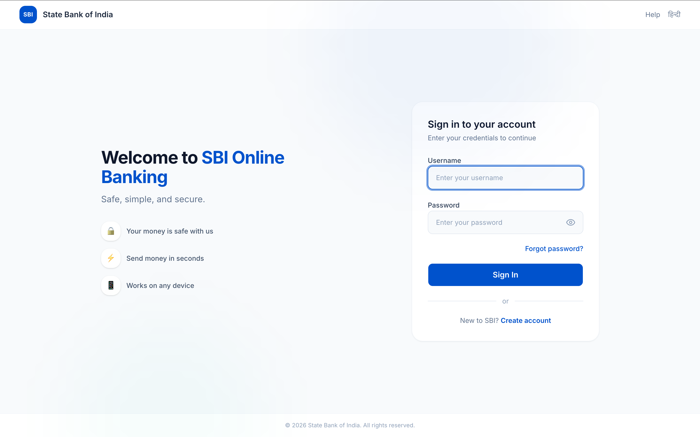
Login — one page, no CAPTCHA, no subdomain hops. Trust signals on the left; sign-in card on the right. Tab to OTP without losing context.
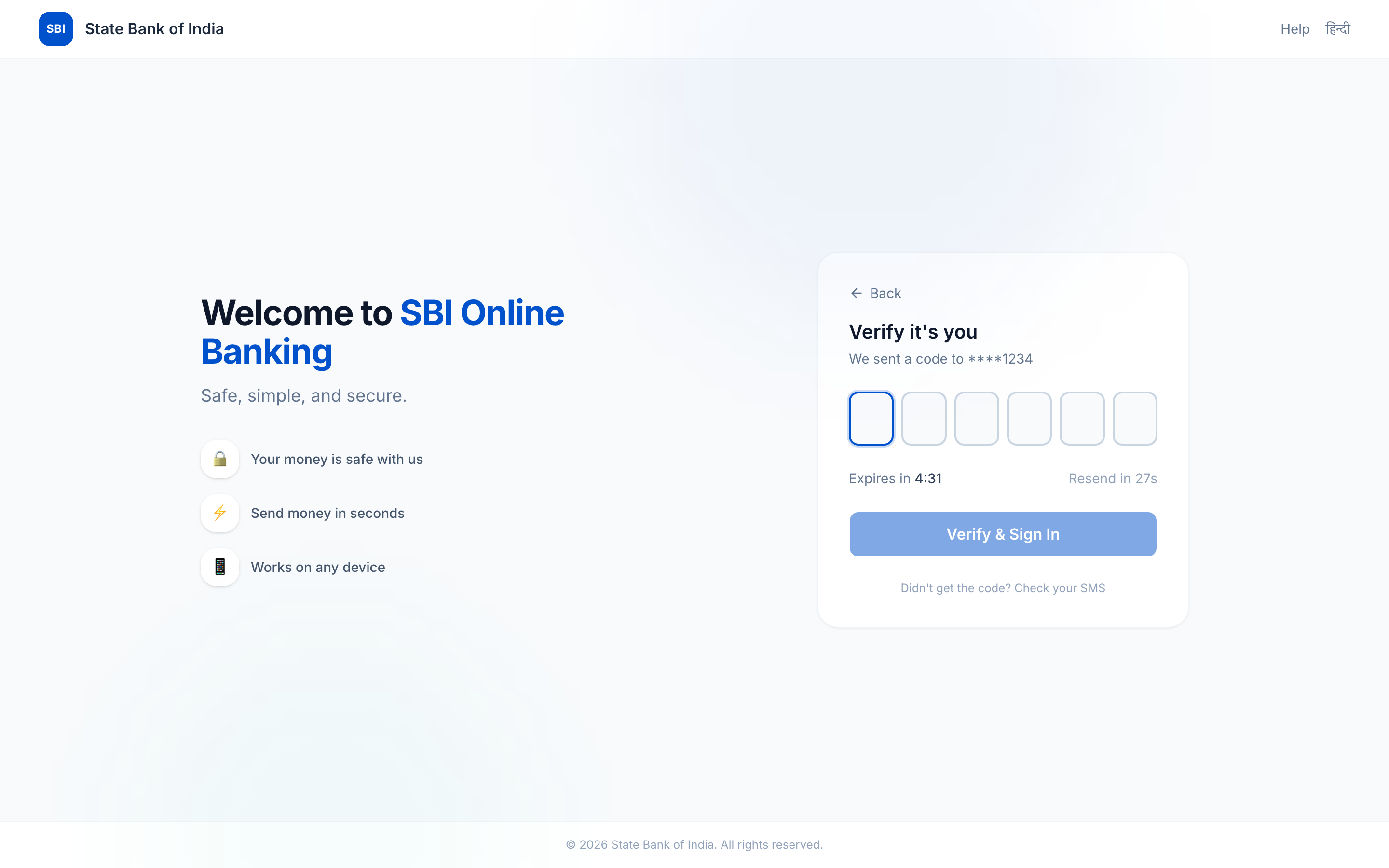
OTP on the same page — animated state transition, not a route change. The user never loses where they are.
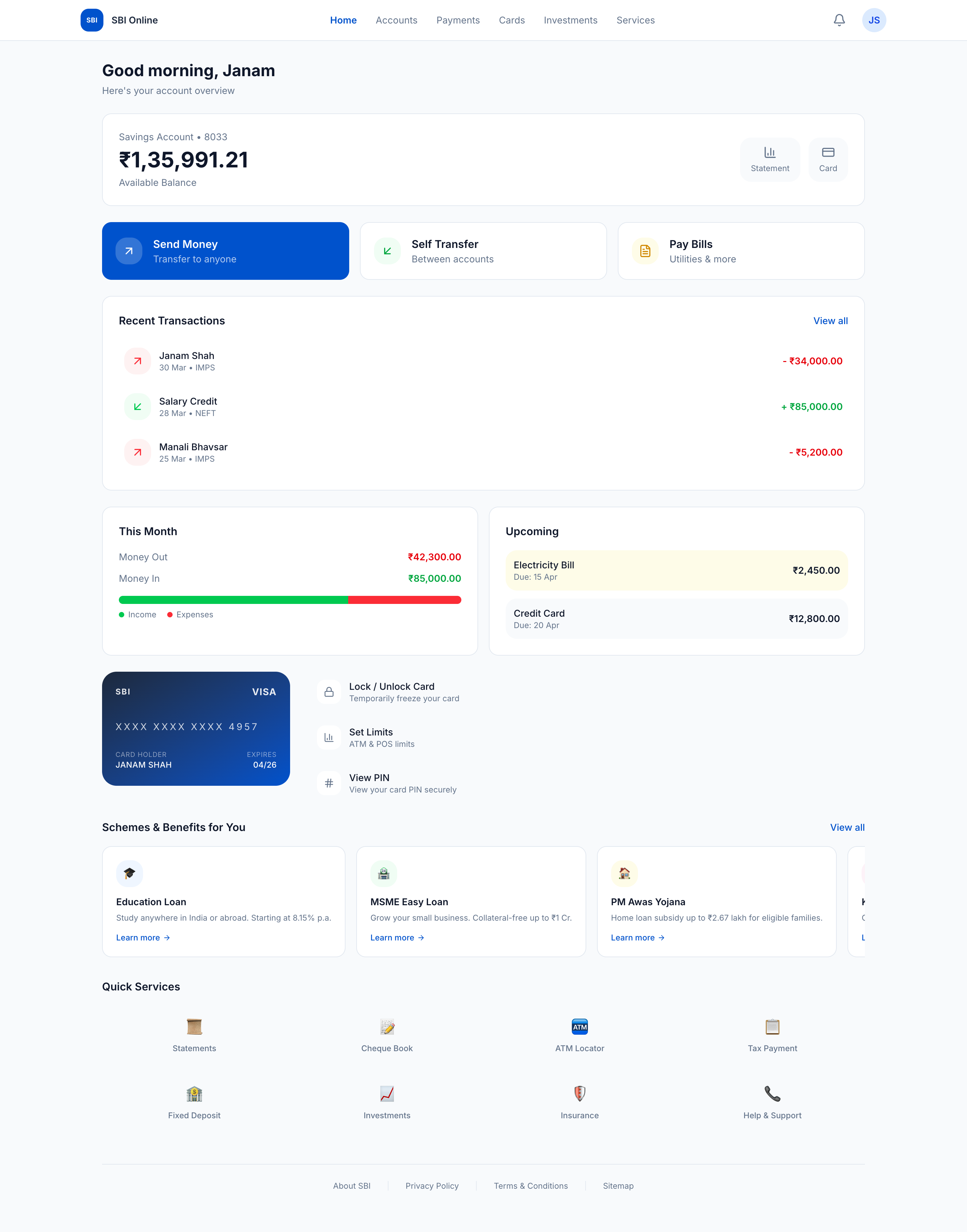
Dashboard — balance first. Three actions elevated; Send Money highlighted because it's the most common task. Schemes and services live below the fold.
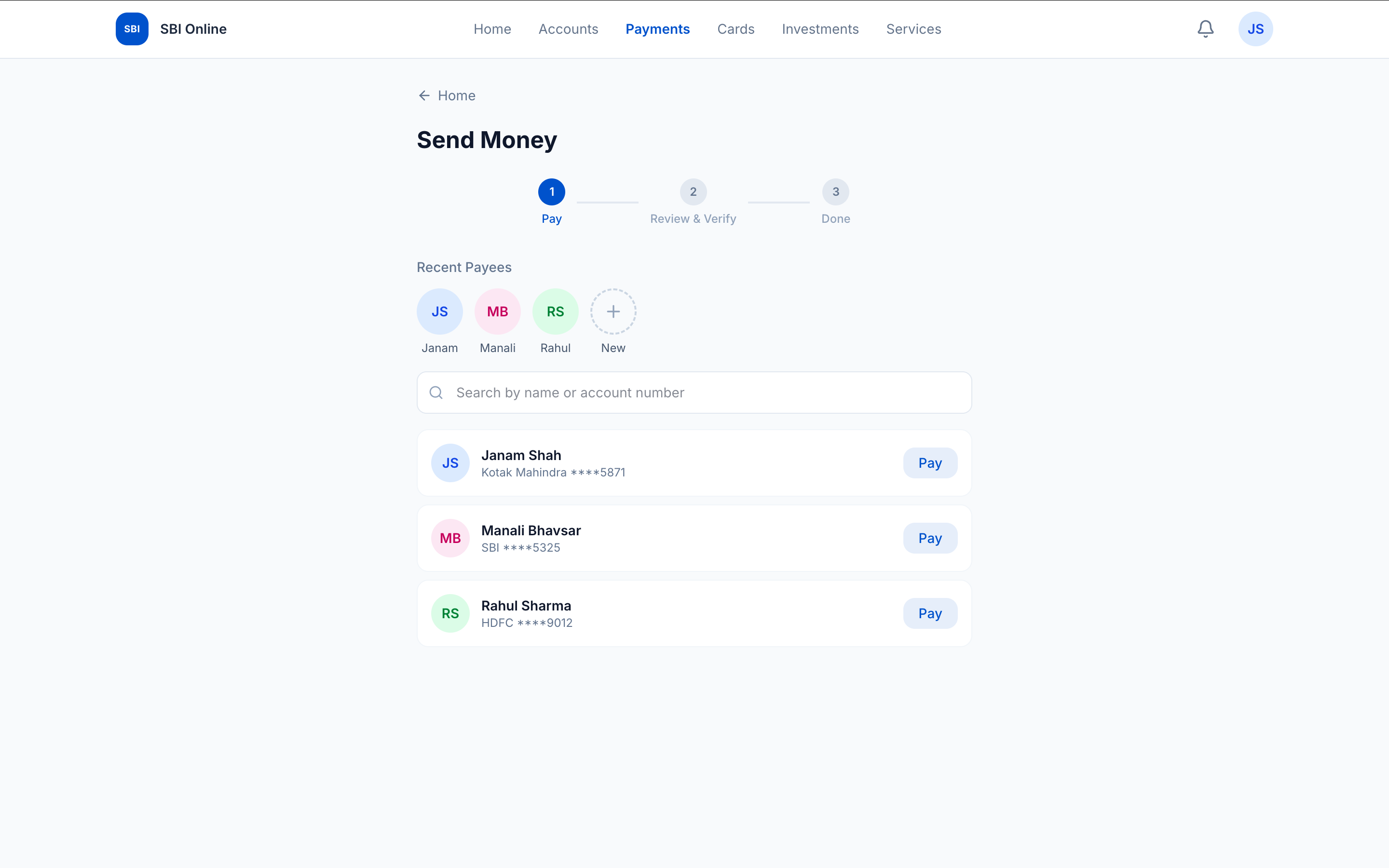
Payment step 1a — recent payees surfaced as one-tap avatars. Search, list, add-new — no modal, no separate screen.
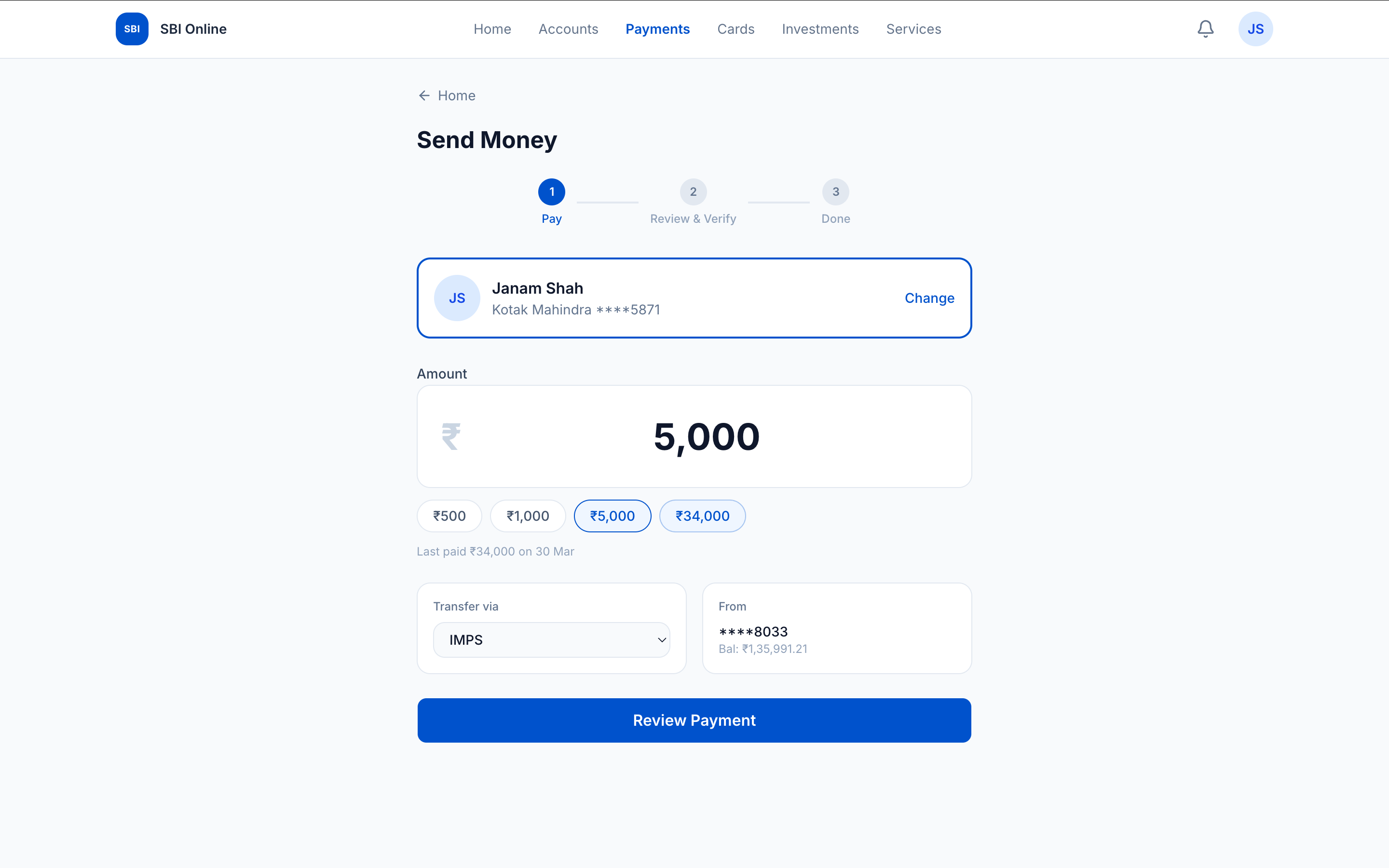
Payment step 1b — amount chips derived from transaction history (last paid ₹34,000 on 30 Mar). The user almost never has to type the amount.
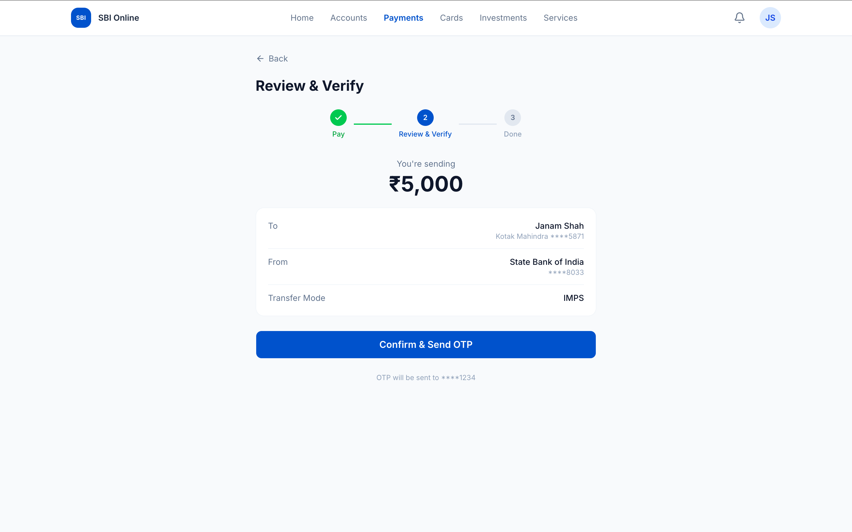
Payment step 2 — review summary. Pay step is checked-green; Done is upcoming. Confirm & Send OTP without losing the page.
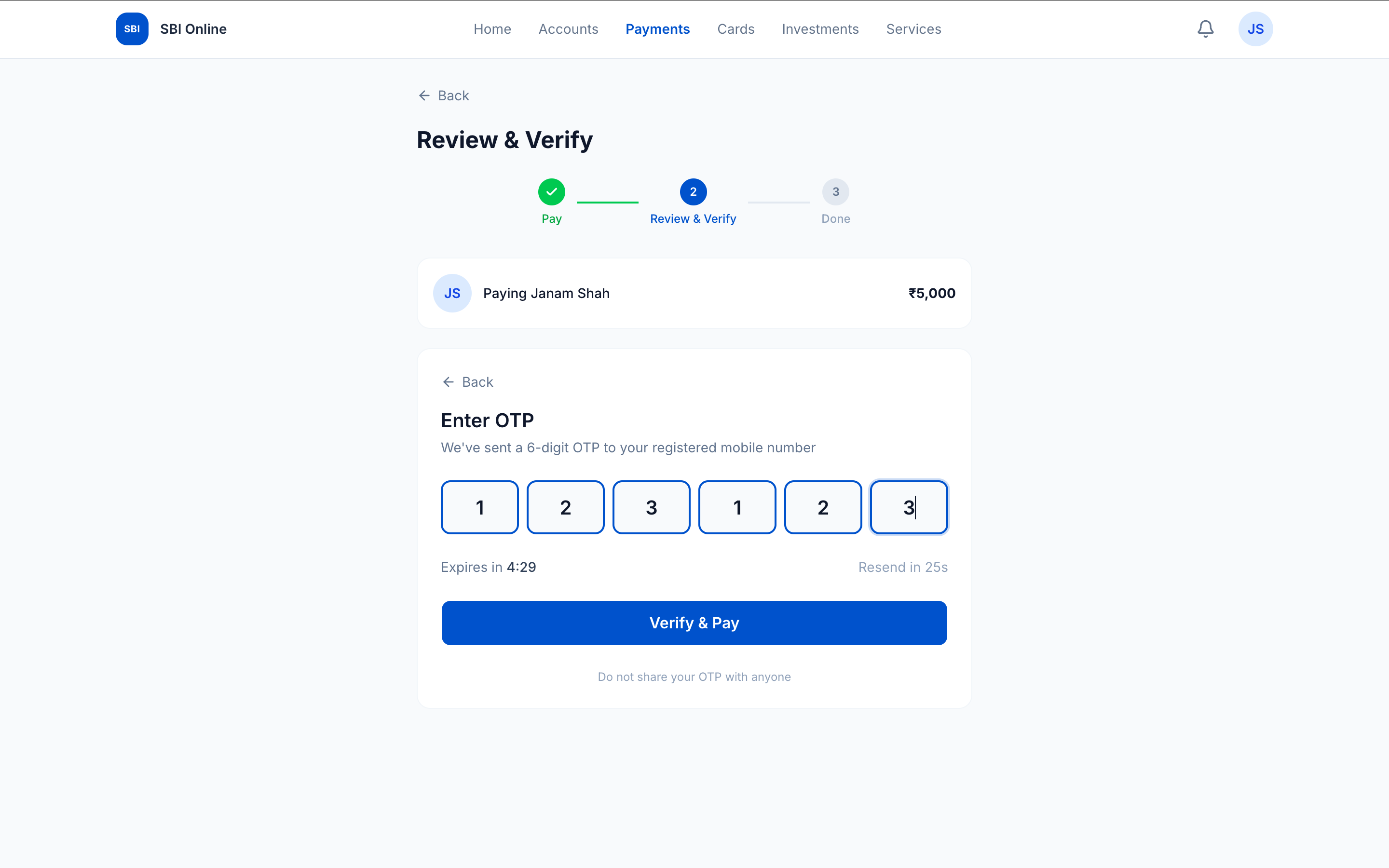
Payment step 2b — OTP slides in below the review summary. The user sees their payment details while entering the code. No modal. No side panel.
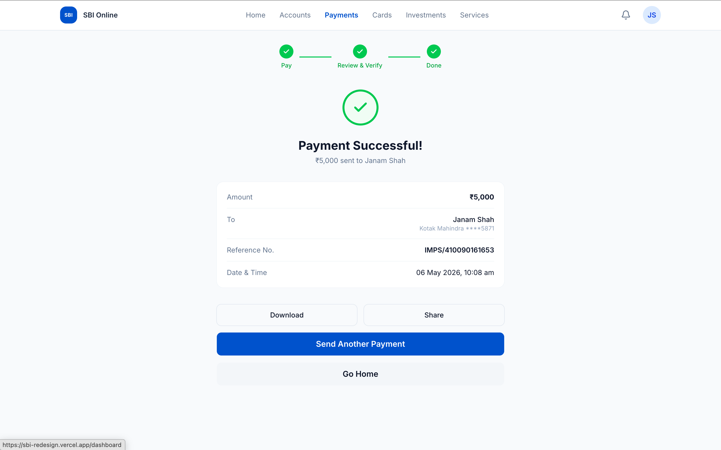
Payment step 3 — done. Reference number, downloadable receipt, send-another path. Three steps total. No carousel ads.
Design decisions
Seven decisions that did the work.
Each decision is traceable to a specific user behaviour I observed during real use of SBI net banking. Not a redesign choice — a use-driven one.
Decision
What it reveals
Remove CAPTCHA, replace with OTP-first
I think security theatre is a UX bug. CAPTCHA exists to deter bots, but OTP already does that. Cutting it removes friction for every human user without lowering the security bar.
Single-page login with animated state transitions
I think trust is built through visual consistency. State transitions inside one page (not page routing) preserve user context — an architectural decision the same person made because they design AND code.
Balance as the first visible element on the dashboard
I start every design from user intent, not business goals. The most basic UX discipline — and the one SBI gets wrong by leading with promotional carousels.
Three elevated action cards (Send Money highlighted)
I think the visual system should encode priority. Send Money is blue because it's the most common action. Self Transfer and Pay Bills are secondary. The other 37 things SBI sells live below the fold.
Amount chips derived from transaction history
I design from lived experience. I pay my own rent through net banking. The system already knows ₹34,000 is the last amount — surfacing it as a one-tap chip eliminates the most error-prone step in the flow.
5 steps → 3 steps for payment
Fewer steps ≠ less information. I merged review + OTP into one page without losing any data. Knows what to combine and what to keep separate.
Inline OTP everywhere
An engineering decision (component composition, not page routing) serving a design goal (context preservation). Only happens when the designer and the developer are the same person.
Context
$1.3B vs ₹0.
Years vs 90 minutes.
Without AI — honest estimate
2–3 weeks
Hand-coding three flows from scratch — scaffolding, state management, payment stepper, OTP componentry, animation polish. Weeks, not days.
With AI — actual
90 minutes
Setup, login, dashboard, payment — deployed to Vercel. Each design decision implemented in the same minute it was articulated. Designer-and-developer fused.
The asymmetry
Eight rows. The institution column is what SBI delivers today across years and a billion-dollar budget. The Janam column is what one person shipped in 90 minutes.
| Metric | SBI | Janam |
|---|---|---|
| Annual budget | $1.3B / year | ₹0 |
| Team | McKinsey + IBM + vendors | 1 person, 1 laptop |
| Build time | Years | 90 minutes |
| Login pages | 3 (3 subdomains) | 1 (2 states) |
| Payment steps | 5 + modal + panel | 3 (inline OTP) |
| CAPTCHAs | 1 per login | 0 |
| Visual identities in login | 3 | 1 |
| Dashboard items above fold | 40+ | 7 focused elements |
Cost transparency
Total to build and host this prototype: about $200 for the month. Reproducible by anyone with the same toolchain.
| Tool | Cost | Role |
|---|---|---|
| Claude Code Max | $200 / mo | AI execution multiplier — writes components, wires state, debugs in real time |
| Next.js + TypeScript + Tailwind | Free | Framework + styling — open source |
| shadcn/ui + Framer Motion | Free | Accessible primitives + state transition animations |
| Vercel (hobby) | Free | Auto-deploy on git push, edge cache, image optimisation |
Scope boundary
What I built is a prototype, not a production system. Login, dashboard, and the send-money flow with dummy data. A production-ready version would need mobile-first responsive design, a formal WCAG audit, secondary flows (statements, investments, cards, loans), and real API integration with SBI's backend services. The prototype proves the design and the speed; production scope is engineering, not design uncertainty.
Closing
The difference between a mockup and a prototype is the difference between an opinion and evidence. One person built a better SBI in 90 minutes. The problem was never technology.
Visit sbi-redesign.vercel.appDeep dive
Inside the 90 minutes,
for readers who want it.
Chapter 1 · The full UX audit
Every design choice prioritises the institution
over the customer.
SBI's net banking requires navigating four pages across three subdomains just to log in. Each page has a different visual identity. The login page disables copy-paste on the password field. The CAPTCHA fails on correct input frequently enough that users have learned to expect it. The OTP page has a wall of security text that nobody reads.
The YONO dashboard presents every product SBI sells — deposits, loans, investments, cards, insurance — on a single page with no hierarchy. A scrolling carousel of cartoon icons sits above a relationship overview that shows account numbers but not balances. The right sidebar contains 24+ links. Promotional banners compete with functional elements. The interface is not outdated — it is actively hostile.
Chapter 2 · Why this is corruption
Procurement, accountability, indifference.
SBI's failure is not incompetence. India does not lack talented UX designers or world-class engineers. India built UPI — the largest real-time payment system on earth. The technology exists. The talent exists. The money exists ($1.3 billion in annual IT spending).
This is structural corruption. Technology contracts awarded through lowest-cost bidding, which systematically selects for the cheapest vendor, not the best design. Nobody at SBI is measured on user experience — the chairman reports net profit, the CTO reports uptime. Nobody reports how many customers gave up trying to log in today.
The people making decisions at SBI do not use SBI's net banking the way their 520 million customers do. That insulation — the comfort of never having to use what you build — is its own form of corruption.
Chapter 3 · The infrastructure-interface paradox
UPI processes 228 billion transactions a year.
PSU banks can't build a login screen.
The IMF calls UPI the world's most advanced real-time payment system. Google Pay, PhonePe, and Paytm built beautiful interfaces on top of UPI infrastructure. Indian consumers proved they can and will adopt digital banking — when the interface respects them.
Yet every public sector bank — SBI, PNB, Bank of Baroda, Canara Bank — delivers interfaces that look like they were built in 2008. BOB's ‘bob World’ app was so badly managed that staff committed fraud to inflate registration numbers. The RBI banned them from onboarding new users.
The same government that built the world's best payment infrastructure cannot build a login screen. The difference is not capability — it is accountability. UPI had NPCI. PSU banks have procurement committees.
Chapter 4 · Each decision in detail
Every choice is traceable
to a real user behaviour.
Amount chips — lifted from real transaction history. Last paid ₹34,000 on 30 Mar. The user almost never types.
Removing the CAPTCHA was the first decision. CAPTCHAs exist to prevent bot attacks, but SBI already requires OTP verification. The CAPTCHA adds friction for every human user to solve a problem that OTP already solves. It is security theatre — visible effort that provides no additional security.
The amount chips came from lived experience. When paying rent monthly, the amount is the same. The system has this data. Surfacing recent amounts as one-tap chips eliminates the most error-prone step in the payment flow — typing a large number on a phone keyboard.
Inline OTP — keeping verification on the same page as the action — is an engineering decision serving a design goal. In SBI's flow, OTP opens a modal or navigates to a new page. The user loses context. In the redesign, OTP slides in below the review summary. The user sees their payment details while entering the code. Only happens when designer and developer are the same person.
Chapter 5 · What AI-assisted development actually looks like
Claude executes.
The thinking is entirely human.
✔ Project initialised — 0:42> build login flow with split-screen + animated OTP state✔ components/login-form.tsx✔ components/otp-input.tsx✔ Framer Motion state transition wired> build dashboard — balance, 3 actions, transactions, card✔ app/dashboard/page.tsx + 7 child components> build payment flow — chips from history, inline OTP✔ 5-screen stepper, reusable across send-money + bills$ git push origin main✔ Vercel deploying...✔ Live — sbi-redesign.vercel.app# elapsed: 1h 28mInside the IDE
Real codebase. Real Next.js project. Hot-reload terminal running. AI accelerates implementation, not architecture.
This is not “describe an app and let AI generate it.” Every design decision — removing CAPTCHA, elevating three primary actions, using transaction-history chips — came from a decade of UX practice and lived experience as an SBI customer. The AI accelerated the execution. The thinking was entirely human. Designer and developer fused; AI accelerated both roles simultaneously.
Chapter 6 · What the research says
The data confirms what every SBI customer
already knows.
SBI Secure OTP app: 1.2 out of 5 stars. MouthShut rating for SBI net banking: 1.72 out of 5. IsItDownRightNow user rating: 1.6 out of 5. These are not outlier reviews — they represent the consistent experience of millions of users.
YONO claims a valuation of $40–50 billion, but this figure has never been independently validated. SBI added 164 ‘enhancements’ to YONO in FY2025 — none of which addressed the fundamental UX problems visible in the login flow. The institution knows. They just aren't accountable for fixing it.
Chapter 7 · What I'd build next
Three production-scope additions
for the next iteration.
01
Mobile-first responsive next
The current prototype is desktop-first because that's how I tested. The majority of SBI users access via phone. A production version starts on mobile and scales up — not the other way around.
02
Formal accessibility audit
WCAG 2.1 AA pass. Screen-reader walk-through for the OTP flow. Keyboard-only path through send-money. The 90-minute prototype hit reasonable defaults via shadcn/ui; production needs an explicit audit, not assumed compliance.
03
Real API integration, not dummy data
Dummy account 8033 with ₹1,35,991.21 makes the prototype feel real. A production version wires to SBI's actual APIs — which is engineering scope, not design uncertainty. The hard problem (what users need) is already solved.
The 90-minute prototype proved the design and the speed. A production-ready version would take weeks — because the hardest problem (understanding what users actually need) is already solved. The remaining work is engineering scope, not design uncertainty.
Chapter 8 · Mockup vs prototype
The difference between an opinion
and evidence.
Behance and Dribbble have dozens of SBI redesign concepts. Most are Figma mockups — beautiful screenshots that were never built, never tested, never deployed. They demonstrate visual design skill but not product thinking or engineering capability.
This redesign is working code. It runs in a browser. It is deployed on Vercel. You can click through the login, navigate the dashboard, and complete a payment flow. It demonstrates not just what a better SBI could look like, but that one person can actually build it — in 90 minutes.